

http://www.samanthahirshberg.com/titleist
Introduction
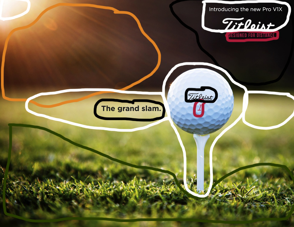
This ad for Titleist golf balls was created to appeal to golfers through depiction of the natural beauty found on a golf course and to promote this specific golf ball as a superior choice to other brands. The designer used a high-quality photo to create a sense of nostalgia as demonstrated by a golf course’s peaceful setting and serene landscape. The golf ball in this ad conveys a sense of superiority to other brands through its professional appearance and through the slogan found in the ad.
The designer for this ad has used professional techniques commonly found in these types of advertisements to catch an audience’s attention and promote this specific product. The following design techniques will be analysed in more detail for the professional ad:
- Design (contrast, repetition, alignment, and proximity)
- Color
- Photography
Design Analysis

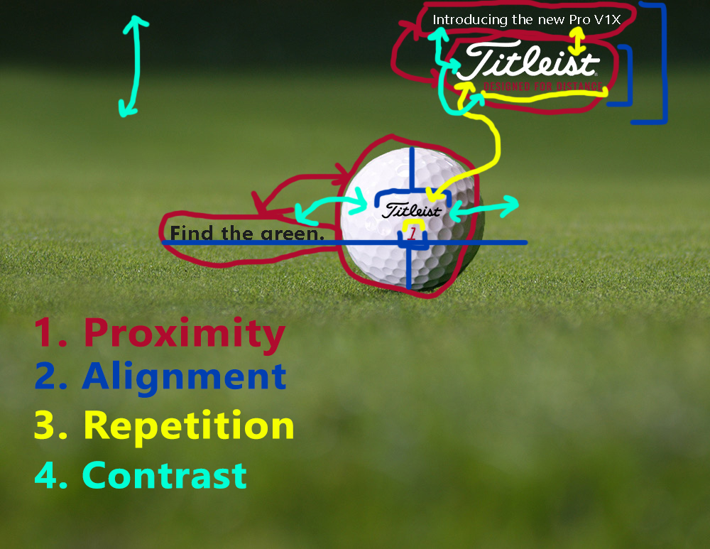
Proximity can be seen in the professional ad in various places. It was used to group certain elements in the ad that go together. The title and logo were placed in proximity to show their relationship with each other and to give information and intent for the ad. Proximity was also used with the golf ball and a slogan to convey the benefits of this product and to show their relationship.
Alignment can also bee seen in the different elements of the ad. The title and logo are given a center alignment with each other in the upper-right corner of the ad. The logo and wording below it are then given a right alignment with each other. Alignment can also be seen with the golf ball. The ball is given a center alignment with the golf tee. The brand and model number on the golf ball also have a center alignment with each other and the golf ball. The slogan on the side of the ball is aligned with the bottom of the model number on the golf ball.
Repetition can be seen in this ad through the fonts and color scheme. The same font is used consistently for the logo in the ad. A sans serif font is used consistently through the rest of the wording in the ad. The same colors are used consistently in the ad as well. White is used in multiple places for the wording in the title of the ad. The red color is used repetitively on the golf ball and in the title. The dark-colored font is also used consistently on the golf ball and the slogan next to it.
Contrast can be seen in the ad with the fonts used. The script font used for the title contrasts with the other sans serif fonts used in the ad. The colors used for the words also contrast with each other. The red and black fonts contrast with the white words. The size of the fonts also provide some contrast in the ad. The larger title font is in contrast with the smaller words surrounding it. Contrast is also seen in the colors of the elements used in the ad. The bright sun contrast with the dark background next to it. The white golf ball also contrasts with the coloring of the various elements on its edges.
Color Analysis
There are a few different colors used in this ad. The main colors are red, green, white, orange, and black. These different colors can be seen in the various elements in the ad.
The ad contains warm colors – yellow, green, orange, and red – that reflect the season of the activity portrayed in this ad. The many warm colors give the summer feel with the combination of these different colors found during this time of year.
The creator of this ad has chosen colors based off the product being advertised. The red, white, and black used for the fonts can all be found on the golf ball. This creates a consistency between the different elements across the ad and makes it appear more professional.
Photography Analysis
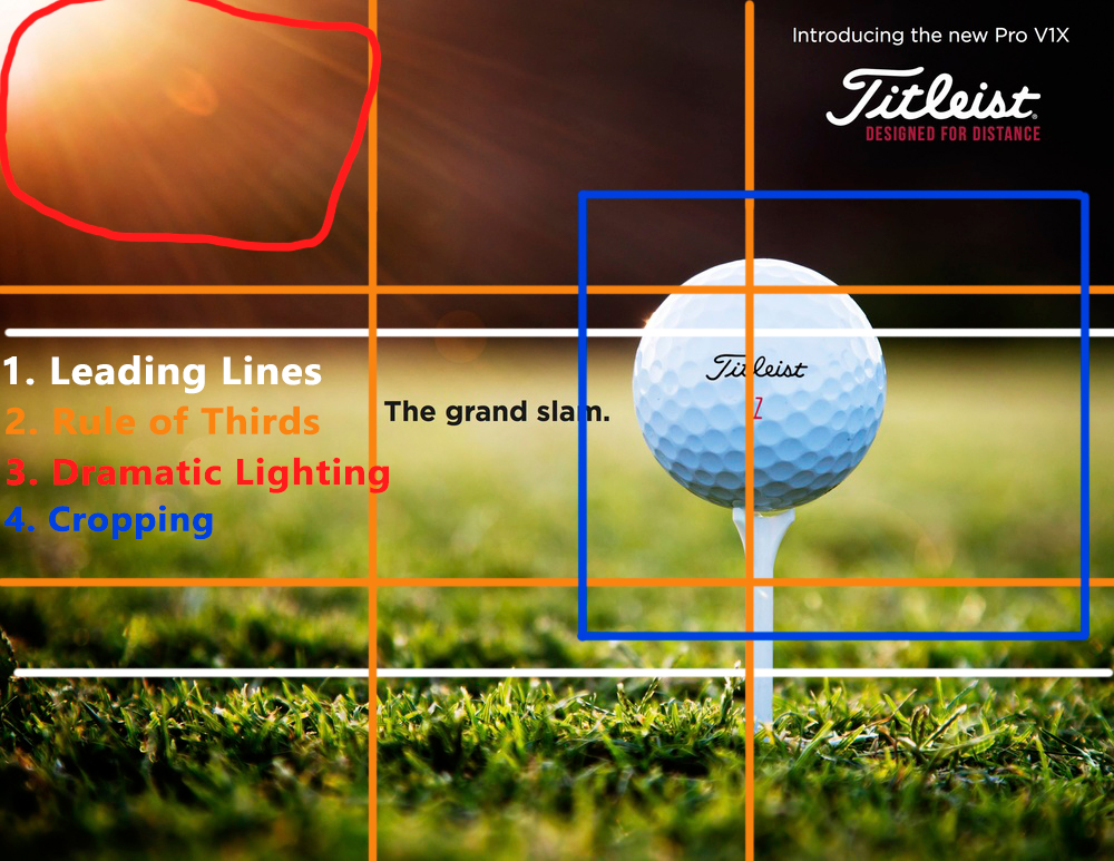
The image of this ad displays many professional photo composition rules that create a professional and pleasing picture to look at. The viewpoint is very close up and at ground level in this photograph. A cropping technique has been used to get a tight focus on the main subject in the photo and remove unwanted noise or distractions from the background by removing detail with a diminished depth of field. This forces the viewer to focus on the main subject in the photo. The rule of thirds has been used by placing the main elements – the golf ball and golf tee – along these segmenting lines and the points of intersection. Leading lines are used in the image to draw the viewer’s eye to the main subject in the photo. The viewer will naturally follow these lines that lead to the golf ball and golf tee. Natural light was also used to improve the quality of this photograph by capturing the dramatic lighting created by the sunset. The lighting effect shows the natural beauty of a golf course and makes the ad appear more professional.
New Ad Analysis

The new ad above has been created using many of the same principles and techniques seen in the professional ad above. It has a similar feel as the original ad by keeping a consistency with the background, coloring, photography techniques, and design choices.
The following topics will be discussed in the paragraphs below:
- Design (contrast, repetition, alignment, and proximity)
- Color
- Photography
These topics are the overall layout and design techniques used in this new ad consistent with the professional ad above. A new slogan was added that varies from the one before, but also conveys a sense of superiority for this brand over others.
Design Analysis
The design for this new ad closely matches that of the professional ad done earlier. There is proximity between the same elements found in the other ad. The title and logo are placed next to each other. The ball and the slogan are also in close proximity to show their relationship with each other. The alignment is similar to that mentioned before as well. The title and logo at the top are given a center alignment with each other. The others words are then aligned to the right of the logo. The slogan is aligned with the bottom of the number on the ball. The logo and number on the ball are also given a center alignment with each other and the golf ball. Repetition can be seen the same in the colors and fonts. The same colors are used with the text and logos to match other colors on the ad. The consistency of the sans serif and script fonts can be see as well. Contrast is similar as before. There is contrast between the dark color of the background and the lighter foreground. There is also contrast between the colors used for the words in the ad. The white golf ball displays contrast with the darker background and slogan next to it.
Color Analysis

A similar color scheme is seen between the two ads. The same red color was used for the text and number on the ball. The background mostly consists of a light green and darker shaded area. There is white that can be seen in the golf ball and some of the text. And there are dark-colored elements that were used for the slogan and logo on the ball. This ad also gives the appearance of summer with summer colors like green and some lighter yellow that can be seen in the grass. Some of the colors were again chosen off the actual item being advertised to give a more consistent and professional look.
Photography Analysis

The same principles of professional photography can be seen in the newly created ad. The main object – the golf ball – is placed along the intersecting lines that obeys the rule of thirds. The image has leading lines that will lead a viewer into the main subject of the ad. Cropping can also be seen with the golf ball and the background in order to remove the unnecessary noise and draw the viewer into the object. The viewpoint is also at the ground level with a close up view of the main subject.
Conclusion
Overall, the two ads are similar enough that they could be used for the same ad campaign. They have similar design layouts. The proximity, alignment, repetition, and consistency found in each ad is consistent between the two. The fonts are the same between the two ads. The sizing of the various elements are similar to each other. The actual sizing of the image is the same between them. The same logos were used. The same colors and wording were used. They have similar images with the same focus and viewpoint. The color scheme chosen is also very similar between them. The colors give a warm summer feel and are accurate to those found on a golf course. The colors chosen for the various elements that come together to create both ads are largely chosen from the product being advertised. And the layout of the photograph is consistent between the two ads utilizing the same professional techniques of leading lines, rule of thirds, and cropping.
